
Success Criterion 1.4.3 - Level AA
Contrast (Minimum)
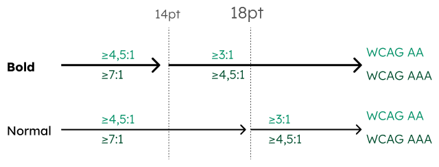
Ensure that the contrast ratio between the text color and background color is at least 4.5:1. For bold and large text, a contrast ratio of 3:1 is sufficient. By maintaining these ratios, visually impaired and color blind users can usually read the text well. In addition, this makes an app easier for everyone to use, for example outside in the sun.
Impact
If text has too little contrast, visually impaired people cannot read it well.
Sufficient contrast makes an app easier for everyone to use. For example, outside in the sun.
Check
"Is the contrast of normal text at least 4.5:1 and the contrast of bold or large text at least 3:1?"
You can take a screenshot of an app to determine the color codes and calculate the contrast. This can be done, for example, with the Contrast Checker of WebAIM.


Flow diagram of the contrast requirements for text, created by Régine Lambrecht