Accessibility features could also be aesthetically pleasing as far as I'm concerned
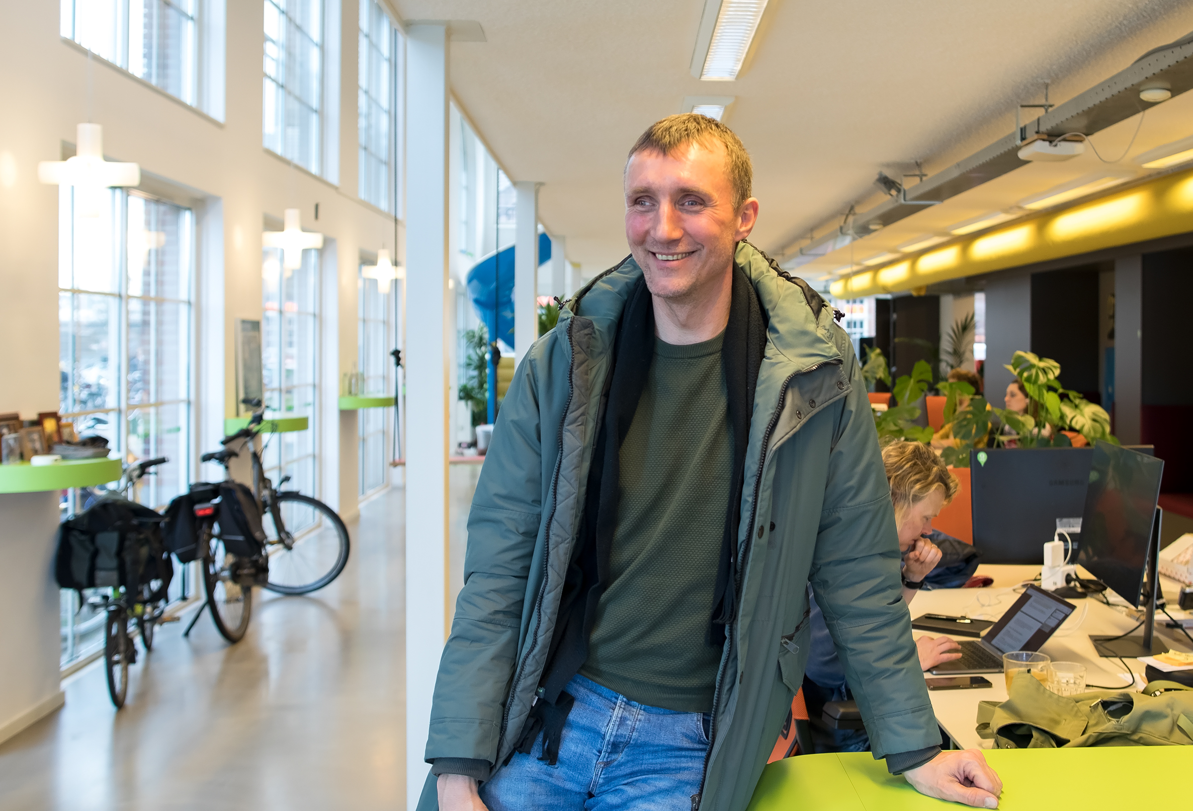
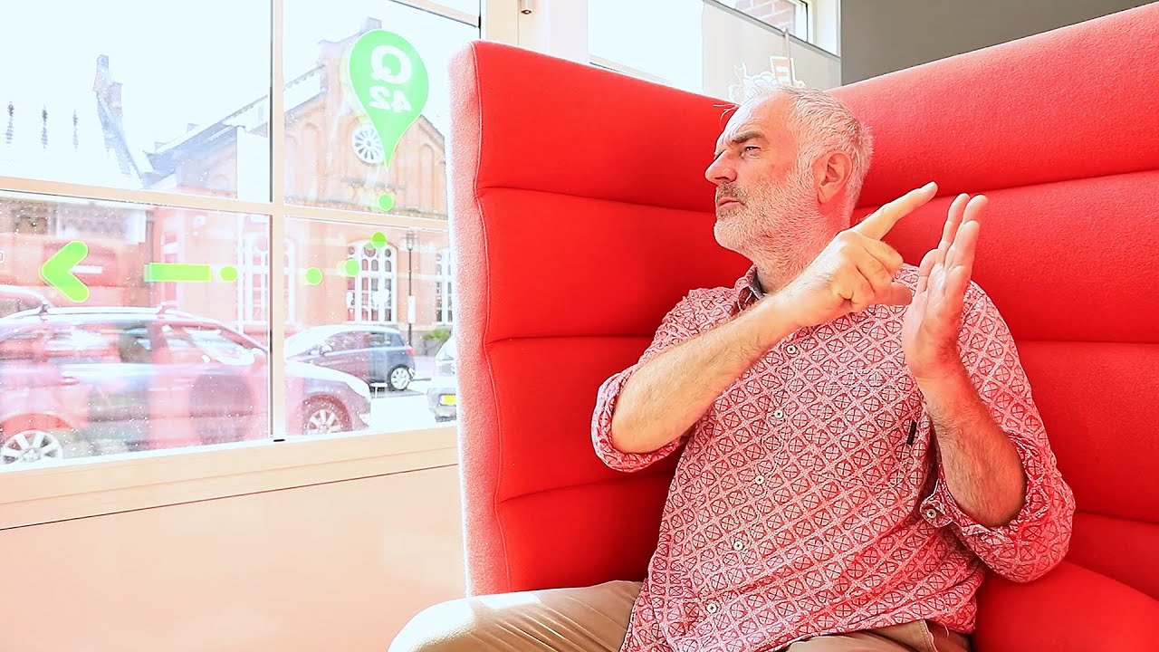
Onno (1967) was born with a visual impairment. He sees only 10% and also has nystagmus (rapidly twitching eyes). This does not count him among the blind, but his situation is of course not comparable to someone who can see. So he is outside the usual categories.
Onno works full-time as a technologist at Waternet. He and his colleagues are responsible for drinking water quality in Amsterdam. In addition to this full-time job, he obtained his PhD in 2021 and is currently a visiting professor in London. Onno has an iPhone 13 Pro, but he would rather have an Android, or a Fairphone because of sustainability.

What accessibility features have you set up on your phone?
I try everything that is possible in terms of accessibility settings on my mobile.
For example, I adjust the light intensity: during the day it is at its brightest.
I also made the letters bigger. Not on the largest setting, because otherwise I miss the overview. So I set the font size in such a way that I can just read texts and still keep an overview.
On my iPhone I adjusted the contrast. I don't use that very big contrast with primary colors. I think that's really ugly. Aesthetics are sometimes hard to find in accessibility settings. I think a greater contrast could also be made tastefully. Moreover: apps that offer little contrast with important information, I do not use.
As a visually impaired person, I also find zooming in on apps very pleasant, but not all apps offer that functionality.
VoiceOver and letting my phone read messages out isn’t intelligent enough, I think: it often just doesn't work well. If it really worked well, I'd find it useful.
More interviews with end users

How many hours a day I use my phone? How many hours do you use your eyes?
Jesse
Read the interview with Jesse